The NASA “worm”: the logo that returned after nearly 30 years

Pocos organismos poseen una identidad visual tan reconocible como la NASA. Sin embargo, a lo largo de su historia la agencia espacial estadounidense ha estado representada por dos símbolos muy diferentes: el conocido emblema circular azul, apodado meatball, y el logotipo rojo de aspecto futurista conocido como worm, o “gusano”. Lo curioso es que este último fue creado […]
I ♥ NY: the logo that was born in a taxi
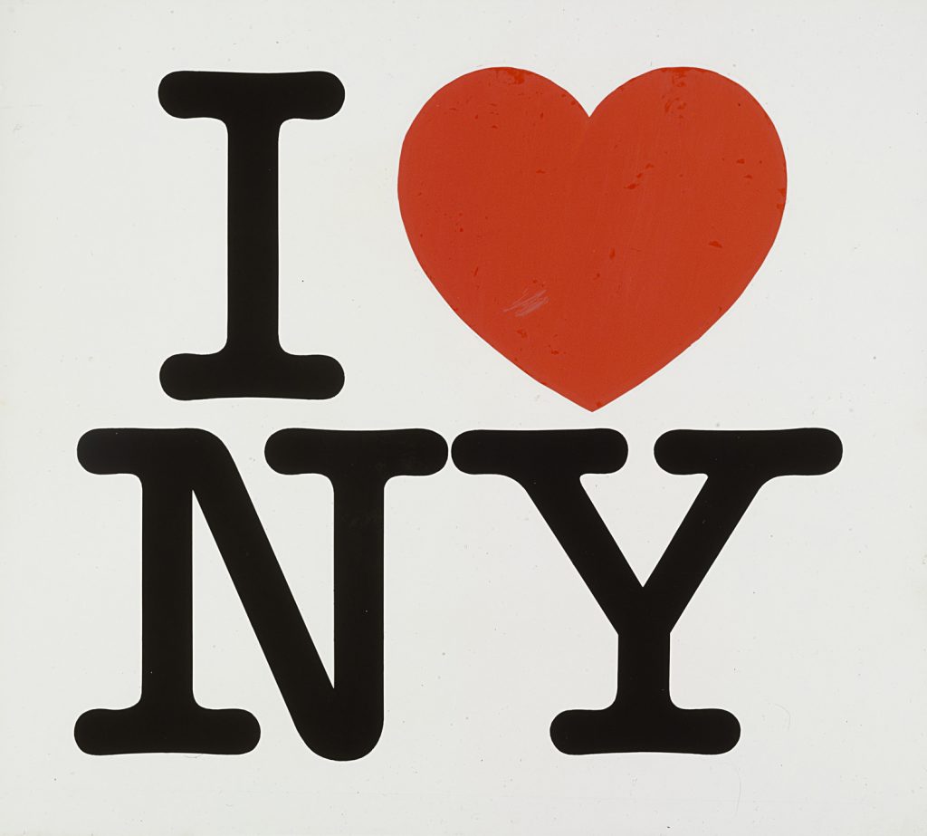
A mediados de los años setenta, Nueva York atravesaba uno de los momentos más complicados de su historia reciente. La ciudad acumulaba graves problemas económicos, el crimen había aumentado y su imagen pública se había deteriorado considerablemente. En este contexto, el Departamento de Comercio del Estado de Nueva York decidió impulsar una campaña con el […]
Back to You by ES Collection
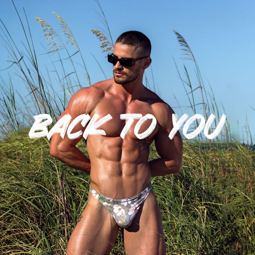
Video editing for the launch of ES Collection’s Swimwear collection. Shot in Miami, the video showcases the brand’s latest swimwear designs.
(Photography: Carlos Campos)
Born to Move by Addicted
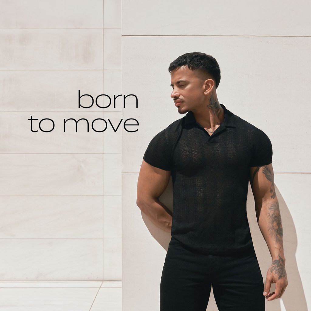
Video editing for the spring campaign of the Casualwear line by Addicted, a men's fashion brand aimed at the gay market. Filmed in Barcelona, the piece showcases the new collection through some of the city's most iconic locations.
(Photograph: Yegor Photographer)
Design meets Desire by ES Collection
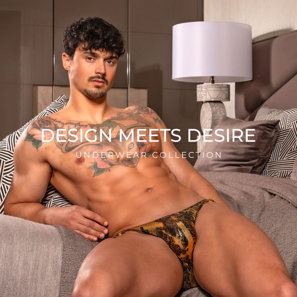
Video editing for “Design Meets Desire”, an ES Collection campaign made up of several pieces dedicated to the brand’s different product lines. This video presents the Underwear collection.
(Fotografía: Paul Vanderline)
Design meets Desire by ES Collection
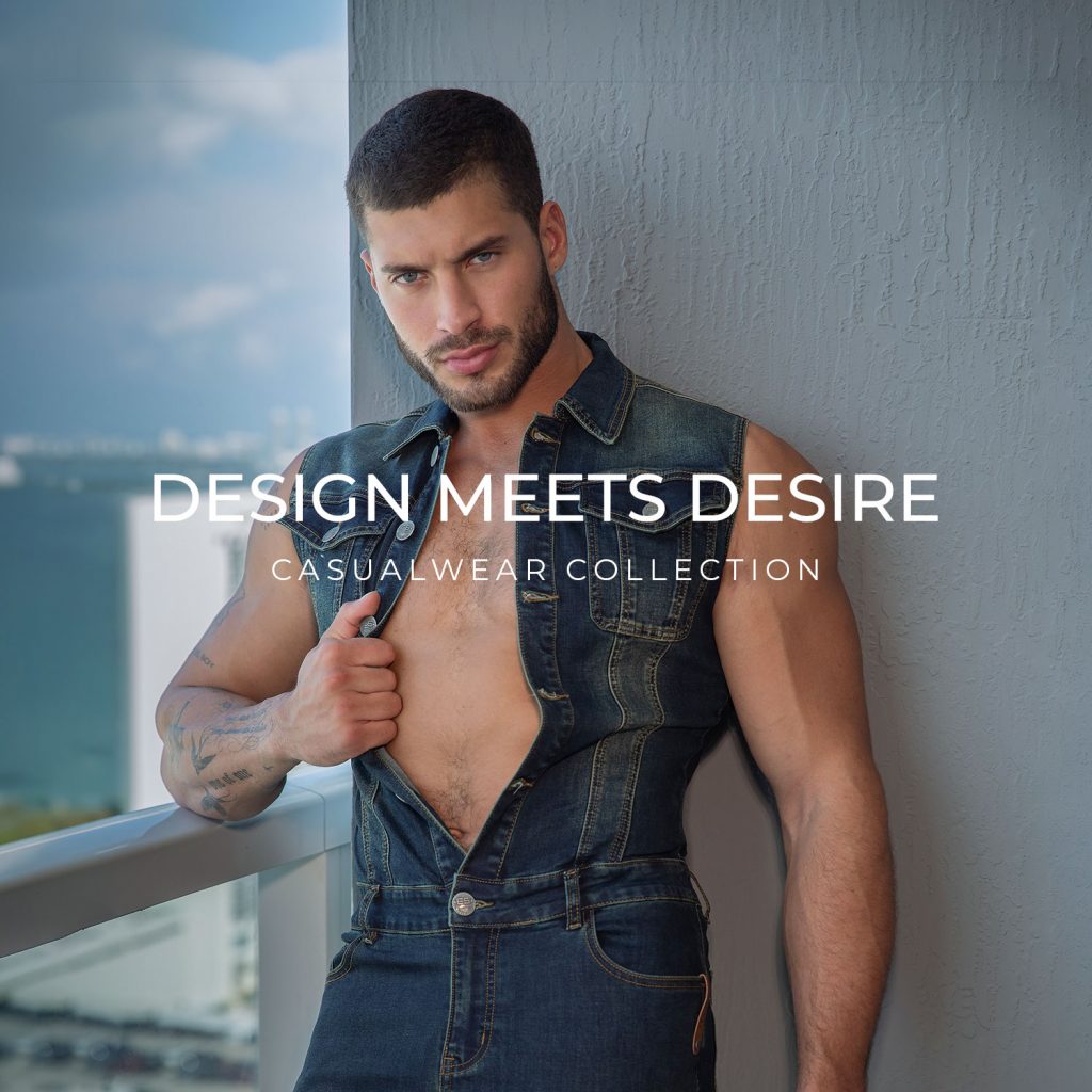
Video editing for “Design Meets Desire”, an ES Collection campaign made up of several pieces dedicated to the brand’s different product lines. This video presents the Casualwear collection and was shot in Miami.
(Photography: Carlos Campos)
Caroni Capital
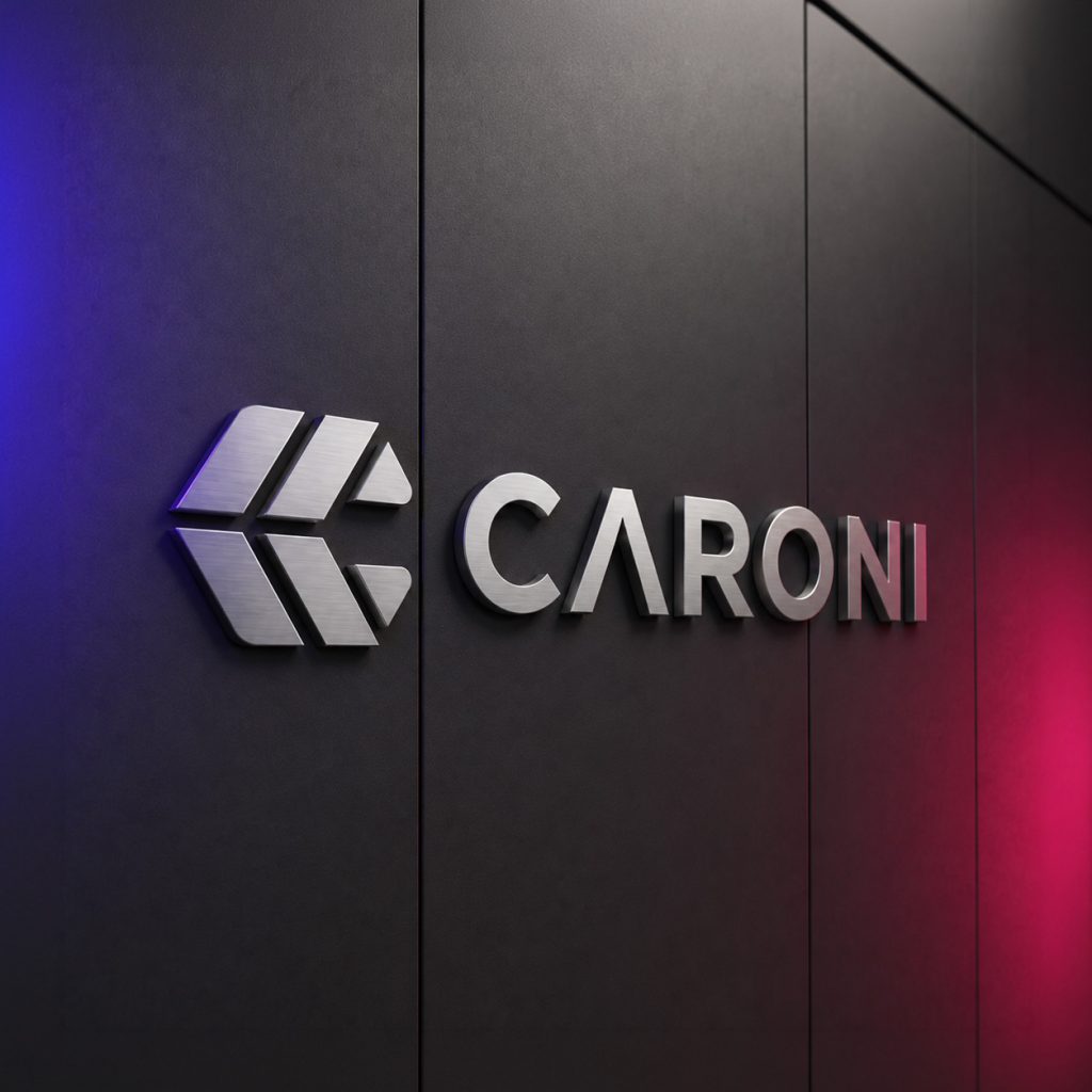
Caroni Capital is part of Atalaya, an international group specialising in investment and global mobility. The company provides access to premium hospitality assets in Italy through a fractional ownership model supported by tokenisation and blockchain technology.
The project included the creation of Caroni’s visual identity, as well as the design and development of its website. The brand combines a modular symbol with a gradient colour palette that conveys innovation, technology and dynamism. For the website, I defined the information architecture, visual language and responsive experience, presenting the investment model in a clear and engaging way.
Prestigik
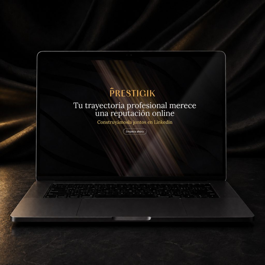
Prestigik is a communications agency specialised in building and managing the LinkedIn reputation of professionals and executives with established careers. Its goal is to transform their experience, values and expertise into a strong, consistent and recognisable digital presence.
Building on the existing visual identity, I designed and developed the website from start to finish. The project included the creation of layouts, graphic assets and infographics, as well as their responsive adaptation. The result combines an editorial and corporate visual language with clear navigation, reflecting the agency’s premium and professional positioning.
Belami Boys by Addicted
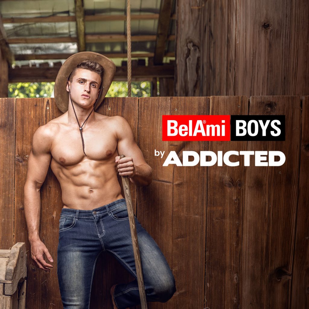
Video editing for the launch of a new collection by Addicted, a fashion brand aimed at a gay male audience. The shoot was produced in collaboration with Belami Productions and its models.
(Photography: Tarek del Moreno)
Pride hand fans
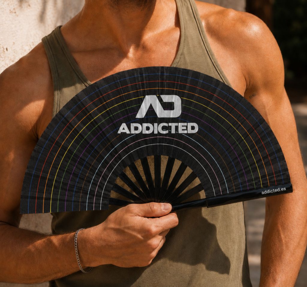
Design of two promotional hand fans for ES Collection and Addicted, created as part of the merchandising for both brands in celebration of Pride. Both designs are built on a black base and use colour as the main visual element, reinterpreting each brand’s distinctive visual universe.
For the ES Collection fan, the design incorporates motifs inspired by Barcelona’s distinctive paving patterns and urban symbols, creating a visual nod to the brand’s home city. The Addicted fan, meanwhile, takes a more direct and graphic approach, built around the colours of the rainbow and the brand’s visual identity.
The result is two functional and distinctive pieces designed to strengthen the presence of both brands during Pride and extend their visual identity into a merchandising format closely connected to the event.